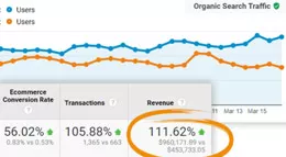
7 CRO Product Page Trends
As long as eCommerce businesses have been around, a good user experience has been foundational to their success. Product pages are certainly a big part of the user experience, yet they don’t seem to get the attention they deserve. Recognizing there’s ample room for growth and that a well-performing product page can’t be ignored, we’ve identified seven product page trends that increase customer experience and conversions. Let’s get started.

1. High-Quality Videos
Video is the most popular form of online content. Incorporating product videos on your pages makes items easier to digest, gives greater detail and establishes consumer trust. This includes product demos, how-to videos and customer reviews.
Another reason to invest in high-quality video is because Google prioritizes video, which gives higher visibility to your brand.
Videos representing your brand must be high quality for maximum impact. Successful video usage on product pages results in increases in traffic, time on page, click-throughs and conversions.
OuterBox recommends including closed captioning on any script for accessibility for all users.

Native Union product video explaining their “night cable”.
2. Digital Photography
Much like video, high-quality photos are a must-have. Baymard Institute finds that 25% of eCommerce sites use images that are insufficient for a user’s product evaluation. Poor quality interrupts the experience and leads to cart abandonment. You also risk getting a lot of of returns from customers who are upset that the item they purchased doesn’t look like it did in the picture. There are plenty of examples on social media – you do not want to be one of them.
To avoid this pitfall, consider including high-quality photos with multiple angles, 360-degree views and/or zoom capabilities. Some product types benefit from closer inspection than others, so tailoring your zoom functionality is essential. Furthermore, when unique product photos are optimized correctly, they can appear in visual SERPs for Google, Bing and other search engines.
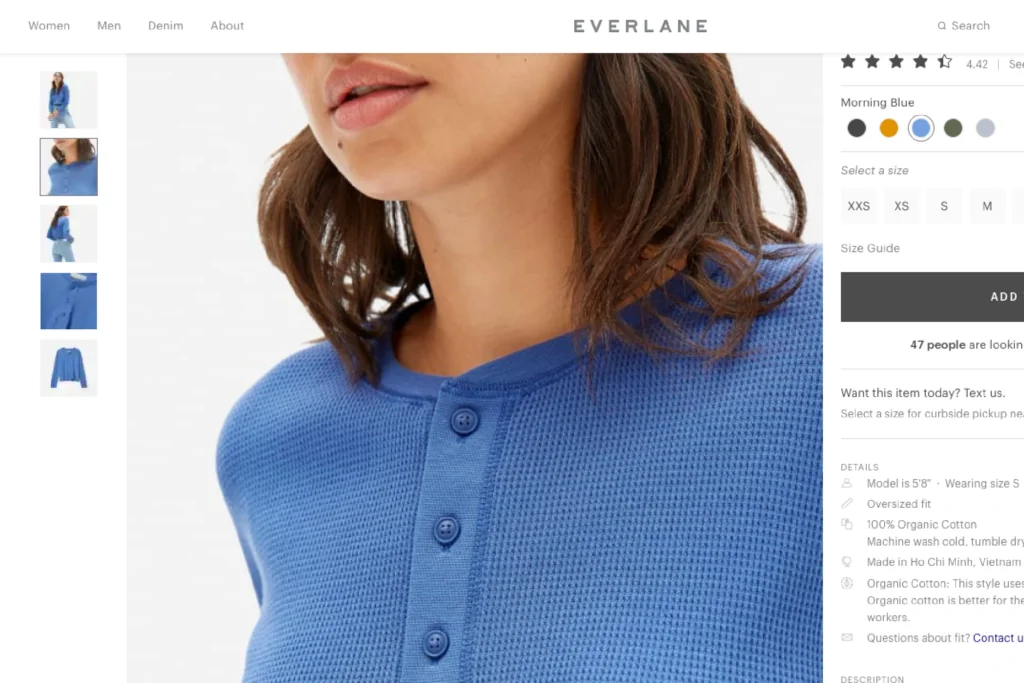
High quality photo with zoom functionality
3. Augmented Reality
In a study from Start Beyond, 53% of customers said they would be more likely to purchase from brands that used virtual reality vs. ones that did not. Augmented reality is impactful because it raises levels of engagement and provides a better, more realistic look at a product.
Take a look at how Sephora lets customers try on hundreds of makeup products through virtual reality on their mobile app. Sephora says this about their makeup app:
Warby Parker embraces a similar approach on their mobile app in utilizing virtual reality to let users try on frames from the comfort of their homes before purchasing. Users better understand how the frames will look on their faces and will be more confident in their choices.
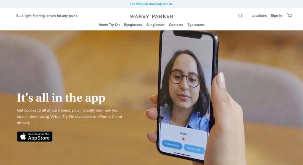
Augmented reality in use from warbyparker.com
4. Anticipate & Address Customer Concerns
The ability to anticipate customer concerns breaks down purchase barriers, leading to more conversions. It’s a way to establish trust and confidence in not just your product but in your brand at large. Two ways to anticipate and address customer concerns are through a size chart and FAQs/ReviewsQ & A sections.
- Size Chart With Customer Feedback: A size chart is important whenever sizing is in play. Do customers who have purchased your product think it’s true to size, or does it run larger than average? Providing exact sizing metrics (inches, feet, etc.) gives consumers confidence in their purchase.
- FAQ /Q&A /Reviews: An area designated to answer questions about a product goes a long way in purchase consideration. In fact, 91 percent of shoppers consult customer reviews before buying. Without a review section, consumers are left guessing as to the quality of your product. Consider also allowing photo reviews from previous purchasers, as 77% of shoppers prefer authentic customer photos to professional images. These photo reviews can also provide proof from social media users who tag your products from their media feeds.
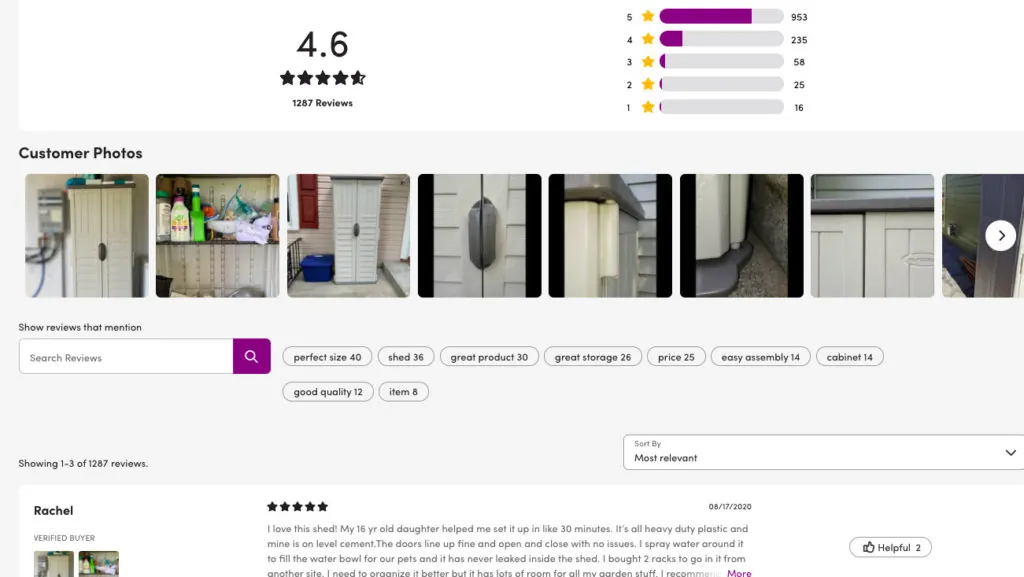
Wayfair.com “reviews” section, including customer photos
5. Effective Cross-Selling
Cross-selling is a sales technique that encourages a consumer to spend more by purchasing an item related to what’s already being bought.
An existing customer will be 60-70% more likely to purchase from you, compared to a 5-20% likelihood of selling to a new prospect. Therefore, a solid cross-selling presence is a significant factor in your product page conversion rates. In fact, Amazon attributes up to 35% of its revenue to cross-selling.
Consider adding or testing a cross-selling section on your site that makes sense to visitors. Be honest and provide value in this area, as it builds confidence in your products and brand.
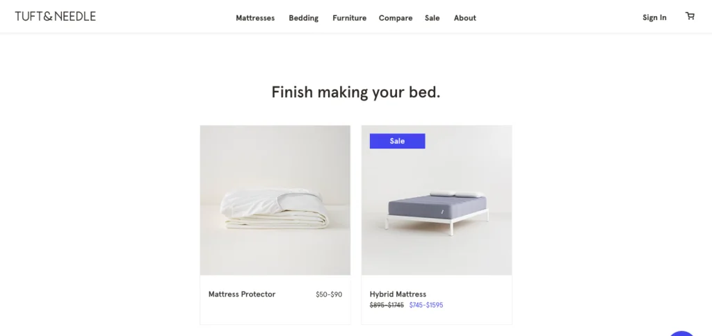
Tuft & Needle cross selling bed accessories
6. Clear Shipping Cost
Baymard Institute shows unexpected shipping costs are the top reason for shopping cart abandonment. A product a visitor thought was reasonably priced is suddenly out of reach when unexpected shipping costs are presented, and they abandon their cart. Clear shipping costs are essential to your online business strategy. An up-front, well-thought-out shipping presentation can increase conversions and create a better customer experience. Consider revamping your shipping presentation if your cart abandonment rate is higher than you’d like.
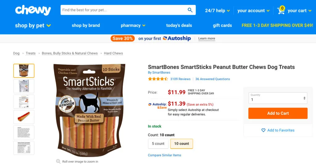
Shipping cost clearly listed right next to product pricing at chewy.com
7. Bookmarks/Save for Later/Wishlists
A holding place for customers to revisit your site benefits both parties. It improves a user’s overall site experience and establishes brand loyalty. Likewise, wishlists bring in customers who may never have visited your site before while they shop for a loved one.
Not only does your site stay top of mind for customers, but it also can help you pinpoint some of your most popular inventory. Consider adding a holding area to your site experience to increase visitors and establish more brand loyalty.
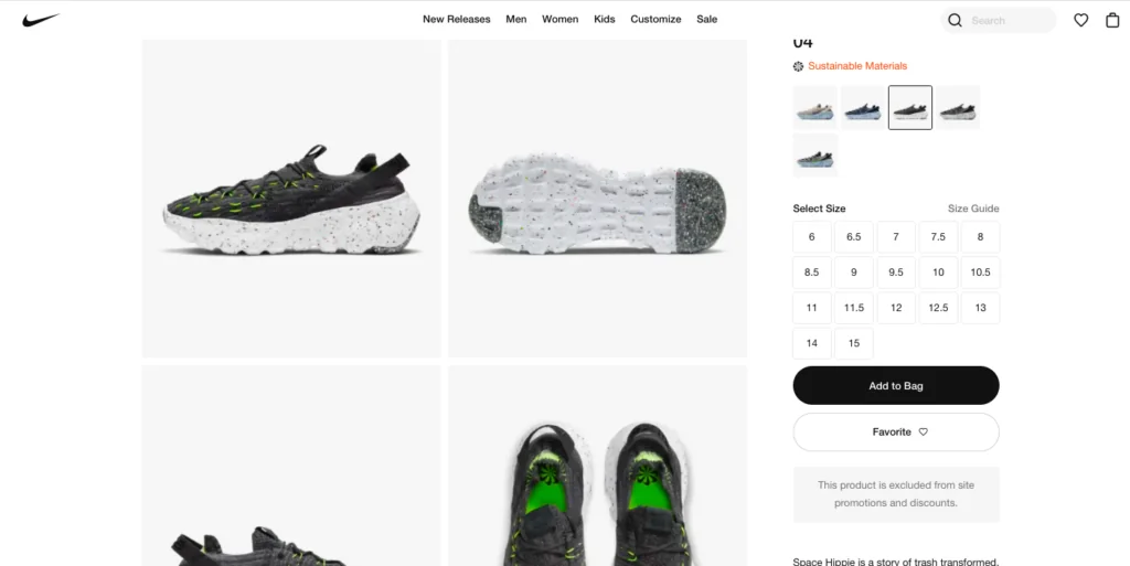
Nike.com‘s use of a wishlist option for users to save their favorites.
Now What?
How is your site performing? Are your product pages as effective as they could be? Which of the above areas will you focus on next?
Ensuring the best customer experience and marketing performance requires continuous site optimization. OuterBox’s data-driven approach will provide peace of mind while elevating your customers’ experiences.
Whether you’re just getting started or you’re looking for data-driven testing that will enhance your site, let us know how we can help. We’ll discuss how to build a personalized plan for your site.

